Project initiated in 2025 at écal Lausanne, Master Type Design.
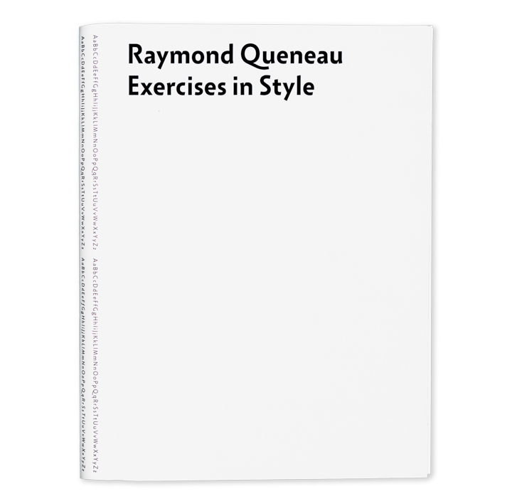
To the specimen
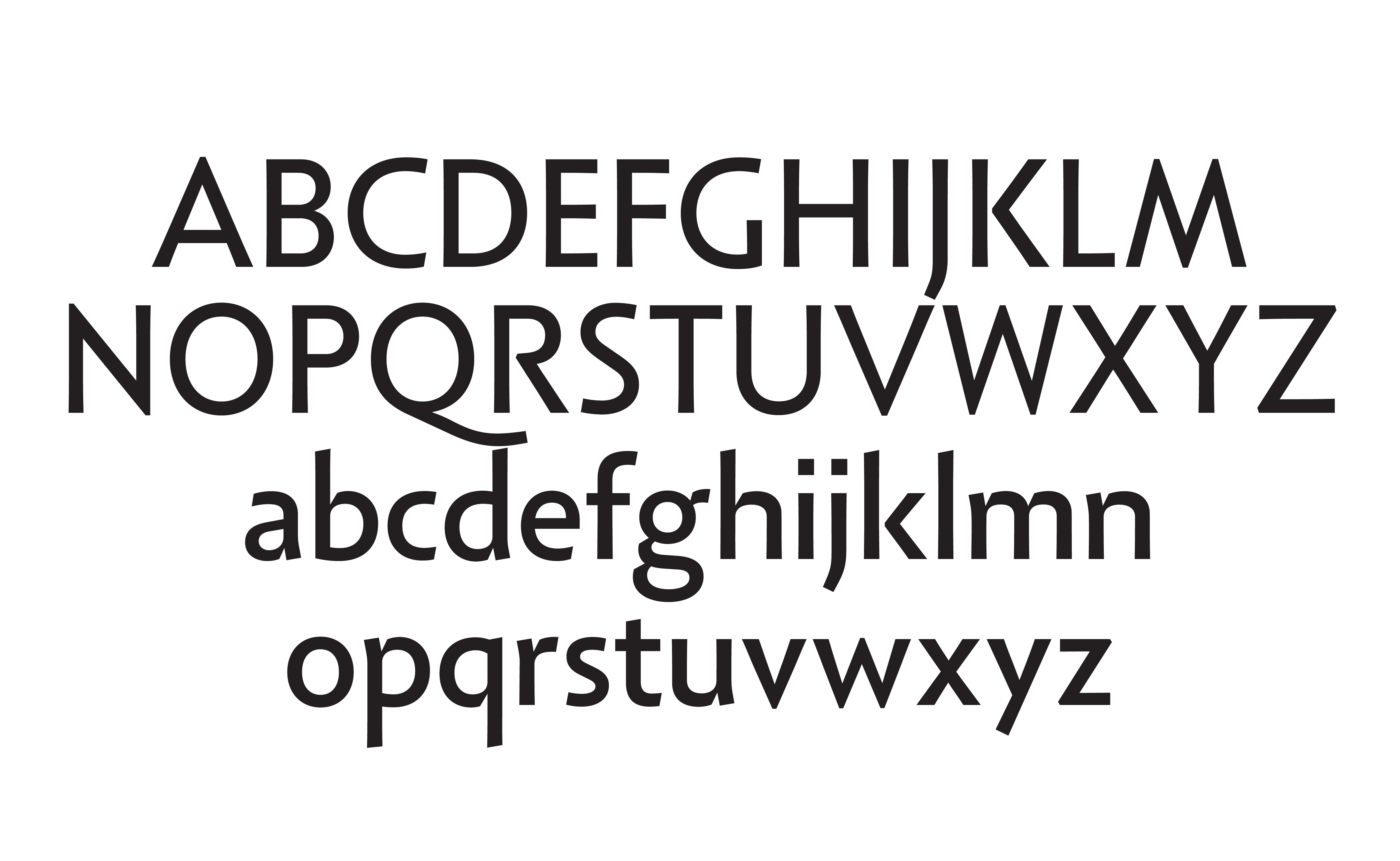
Following the discovery of an early Roman sans-serif inscription at the Pompeii archaeological site, common notions about the development of typographical styles were called into question. Retracing this development, it became evident how the typographical family as we conceptualise it today (uppercase, lowercase, italics, etc.) is the coming together of different versions of the same letters, originating in different historical contexts: uppercase from Roman Capitals, lowercase from Carolingian Minuscule, italics from Chancery Script, and so on.
Rather than modifying the structure of the letterforms of these different influences to fit a cohesive look, Pastiche achieves cohesiveness by modifying the style of the strokes, so that each part of the alphabet remains accurate to its historical origin.
The result is a humanist sans-serif family ranging from thin to black, with corresponding italics, that functions particularly well in text settings.
Project initiated in 2025 at écal Lausanne, Master Type Design.