Project initiated in 2025 at écal Lausanne, Master Type Design.
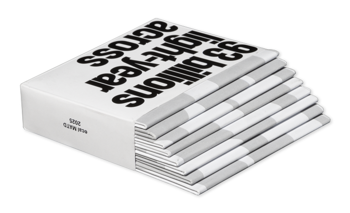
To the specimen.
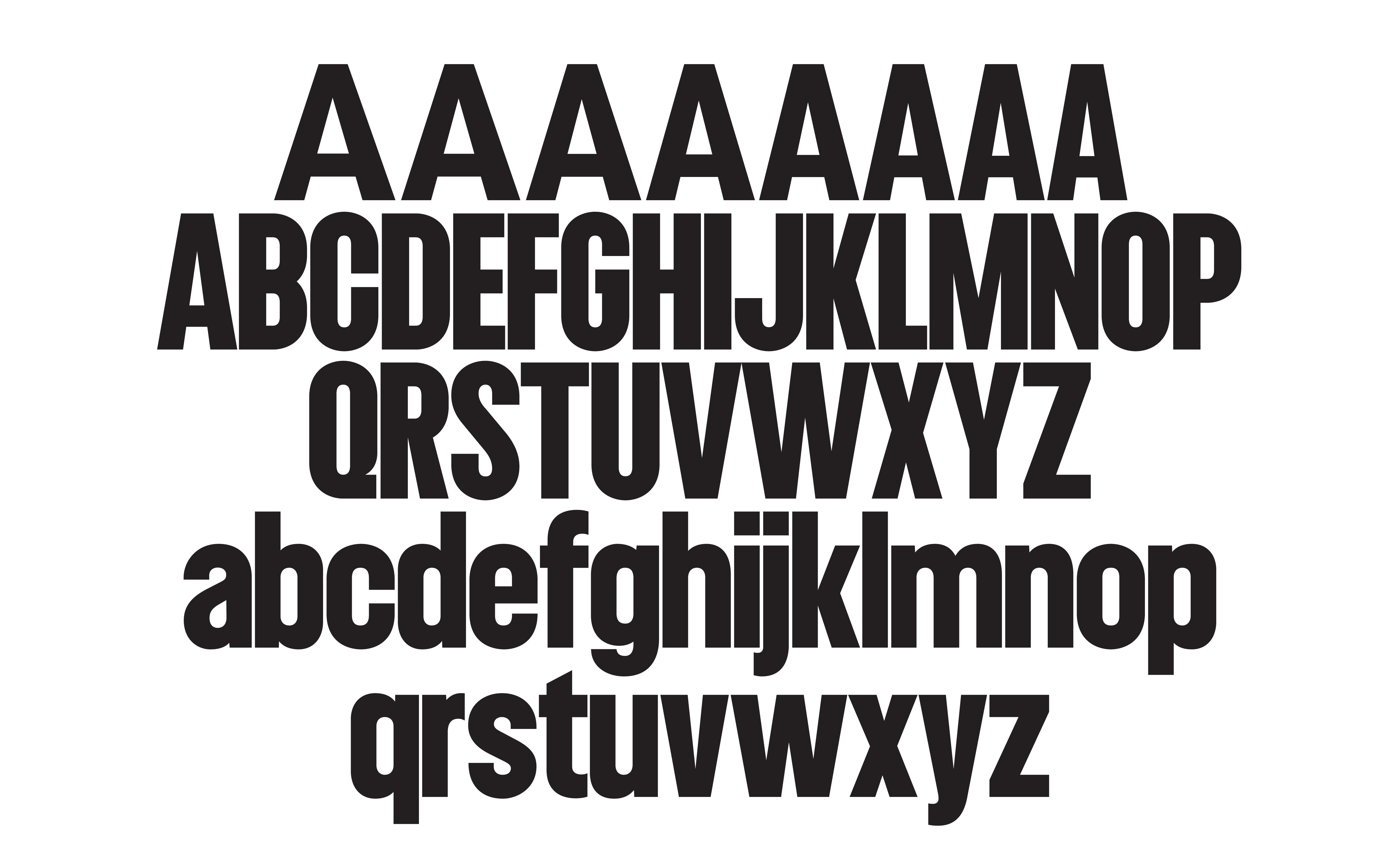
This typeface was developed with relative scale in mind, starting from poster type of the 1950s and 60s and its use across both monumental and medium sizes — from posters and huge lettering to book and LP covers.
The resulting display typeface ranges from a very geometrically constructed narrow version, for the biggest sizes, to a round and heavily optically corrected version for smaller sizes. While the range of changes is considerable, it is designed so that, when looked at from a distance — as you would a poster — the extremes still belong together cohesively. This allows the bigger sizes to function graphically for short headlines, and the smaller sizes to function for longer texts as well, since as the scale of the type decreases, the amount of information it carries often increases.
Project initiated in 2025 at écal Lausanne, Master Type Design.