Project initiated in 2026 at écal Lausanne, Master Type Design.
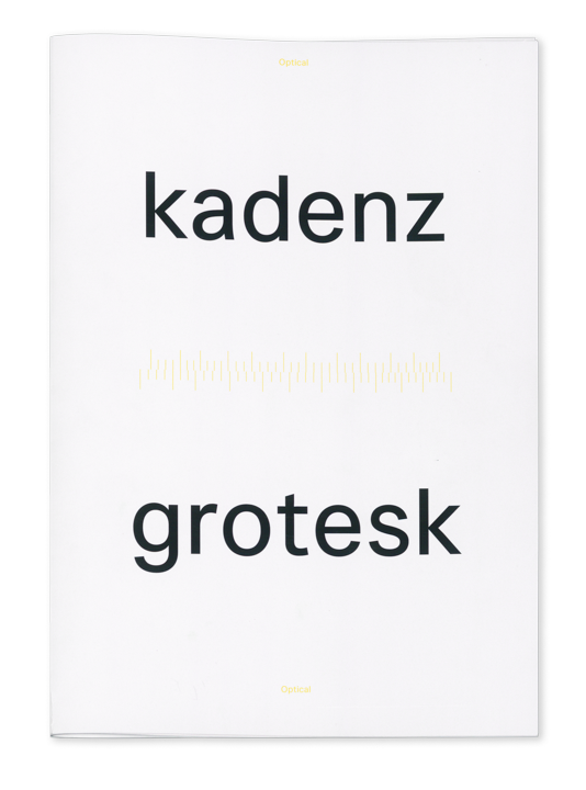
To the specimen
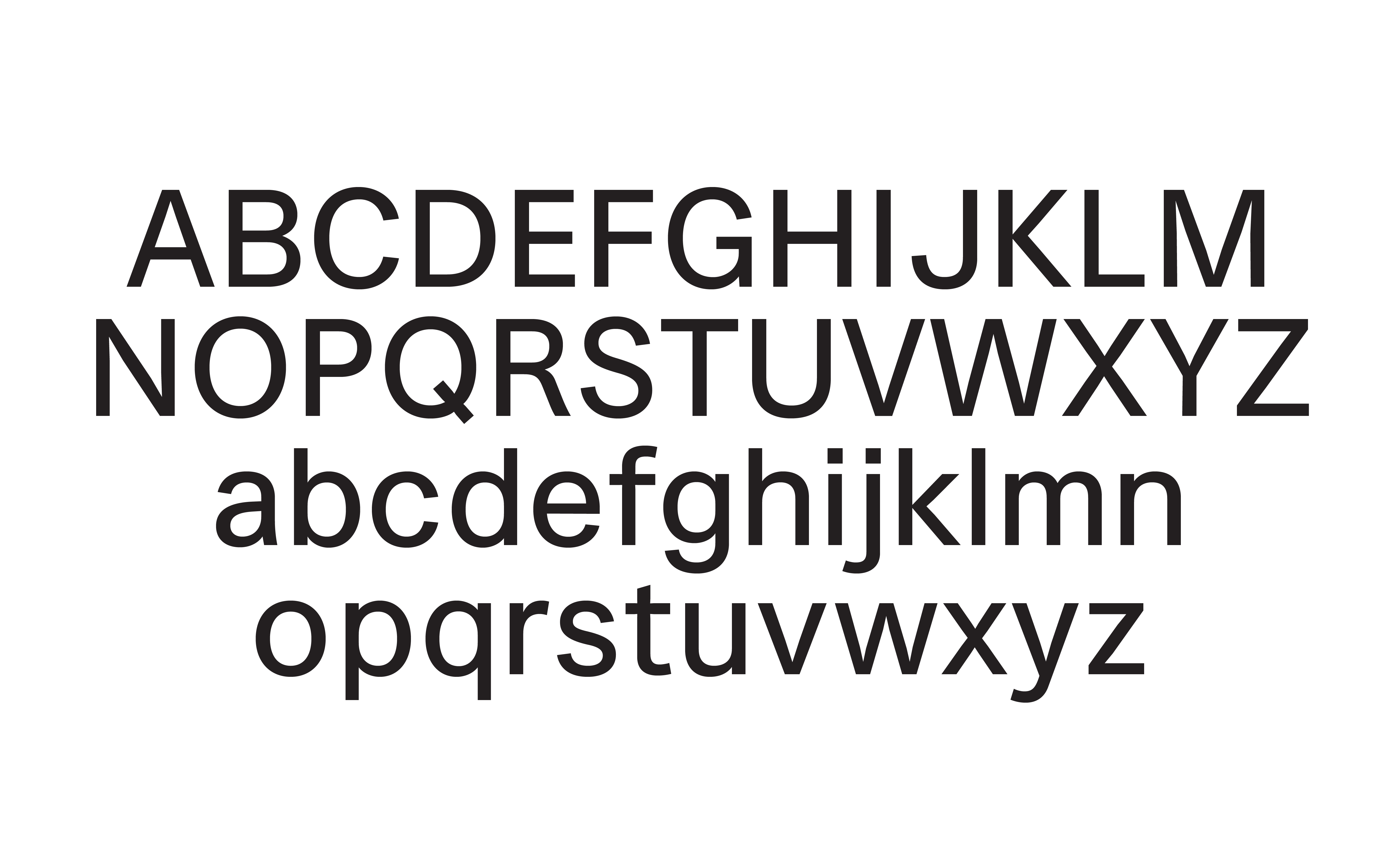
Kadenz Grotesk explores the way we understand rhythm in typography. The typeface is a neo-grotesque that, while not directly inspired by any specific historical source, aims to represent the grotesque style more broadly. Through an extensive research process, several possible approaches to rhythm were identified, and using the optically designed version of the typeface as a starting point, these approaches were put into practice, creating a family of four styles that, through changes in the rhythm of the strokes alone, have radically different appearances once set in text.
The four styles are: Optical, the original version, designed purely optically; Metric, a rationalised version in which all the vertical strokes of any letter fall on a regular underlying rhythm; Syncope, designed as the opposite of the Metric version, in which letters are divided into groups with similar skeletons and their rhythm is changed so that no regular rhythm ever occurs once set in text; and Mono, in which the rhythm is defined not by the strokes in relation to one another, but by the outside limitation of each sort’s consistent width.
Project initiated in 2026 at écal Lausanne, Master Type Design.