Project initiated in 2025 at écal Lausanne, Master Type Design.

To the specimen
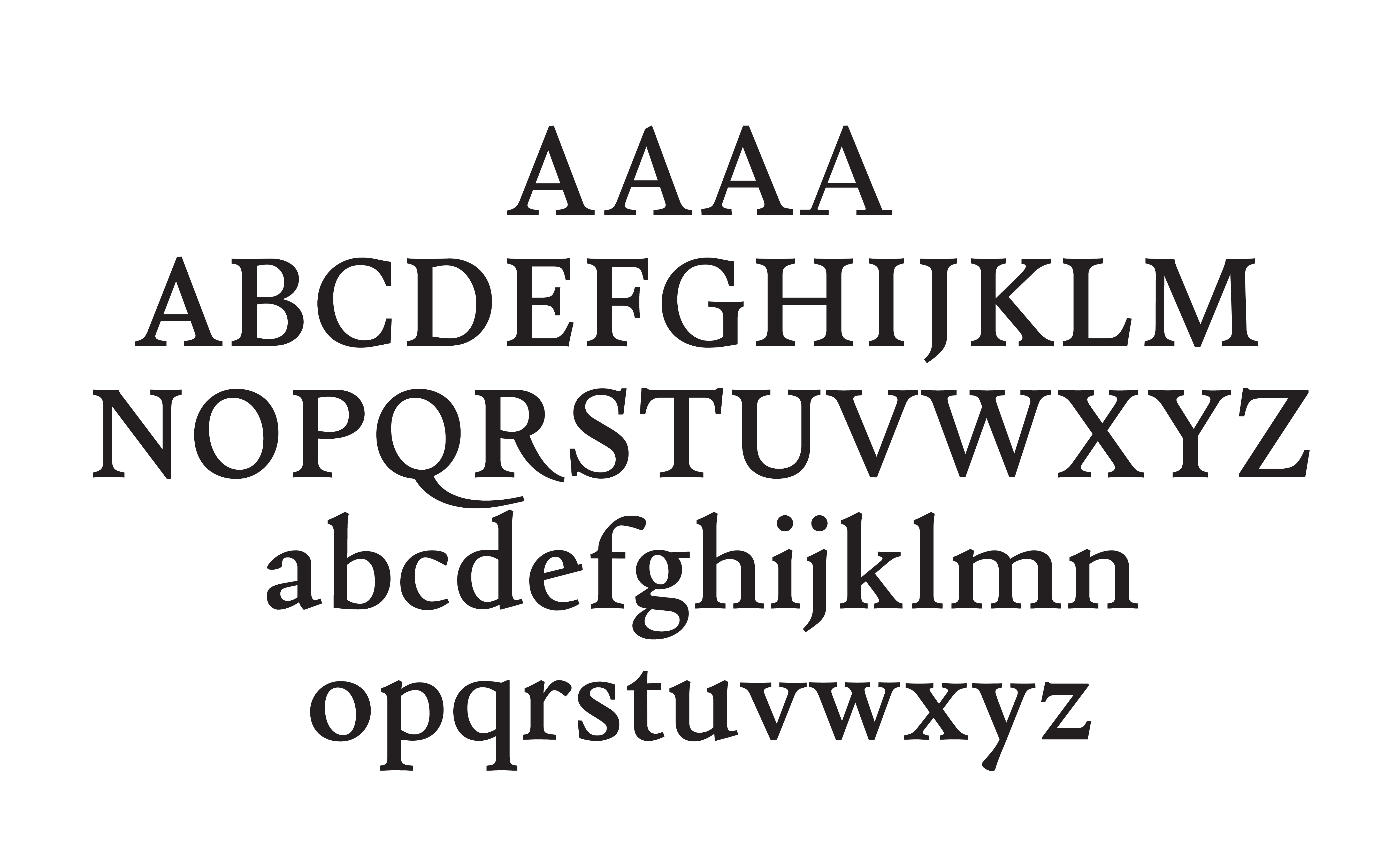
The typeface retraces the stylistic development of the Latin alphabet through history, starting from early Venetian styles and ending in neoclassical Didone styles. This development, represented through a custom variable axis (YEAR), is divided into four key historical moments:
The origin, Venetian (1470), synthesizes the early type of the period.
The second key moment, French Renaissance (1550), draws from the type styles of that era.
Transitional (1700), the third step, marks the shift toward more rationalized letterforms.
Ending in Didone (1830), inspired by Didot, Bodoni, and Walbaum.
While the typeface is not a revival, each instance is meant to be representative of the key characteristics that define the visual appearance of a typographical period.
The interpolation between these instances is, on the other hand, not representative of any specific time; rather, it allows the changes that happen to be clearly identified in a visually explicit way, and allows the user to define how close to the “prototypical” style to remain, or whether they prefer to increase or diminish the influence of the previous or later period on the typeface.
Project initiated in 2025 at écal Lausanne, Master Type Design.